This project belongs to a New Zealand company called New Zealand Safety Blackwoods (NZSB). NZSB is the leading supplier of safety equipment, engineering supplies, uniforms, and packaging in New Zealand. Our project was to redesign their E-commerce website and deliver a Minimum Viable Product (MVP) tailored for their punch-out customers. The company emphasized the need for a responsive website that would work seamlessly on mobile devices.
There were several significant challenges in their existing system:
Through analyzing existing data and conducting usability tests and interviews, we identified three major pain points:
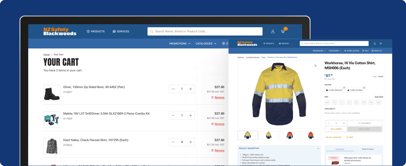
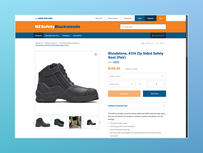
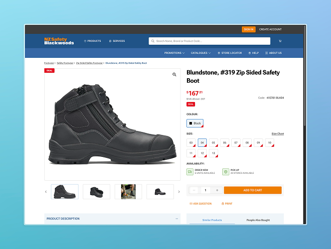
"To address these issues, we designed a more user-friendly MVP, along with a robust design system that prioritised clarity, accessibility, and scalability. Additionally, we implemented a mobile-first responsive design to ensure seamless performance across all devices."
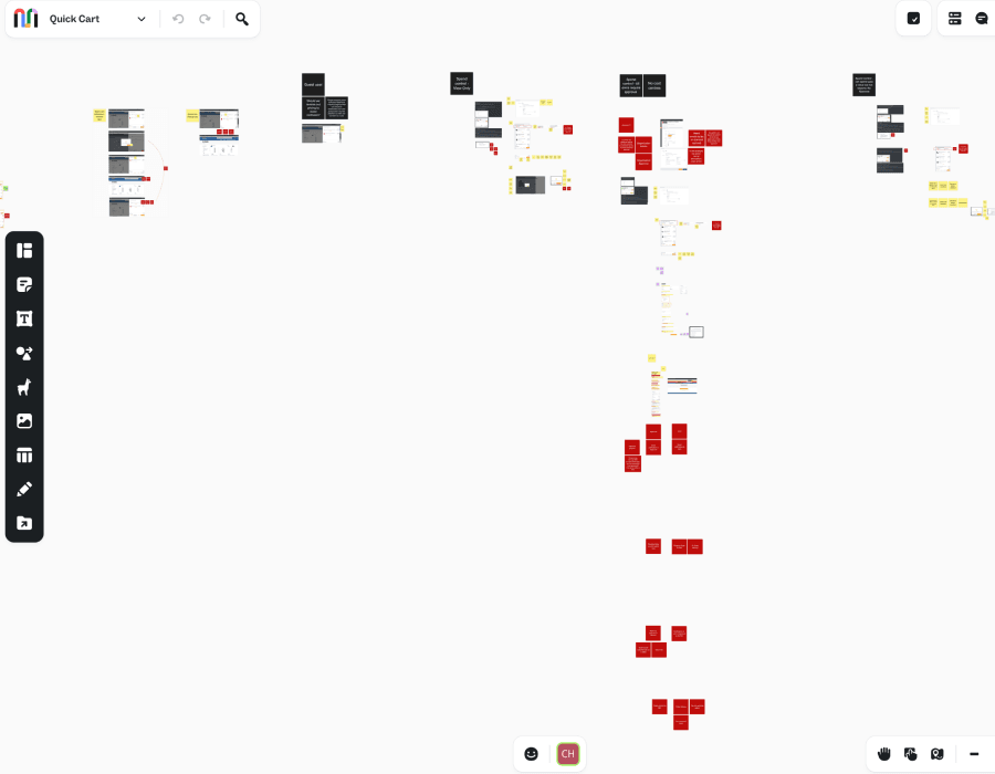
Mural Board with brainstorming ideas and client /user feedback
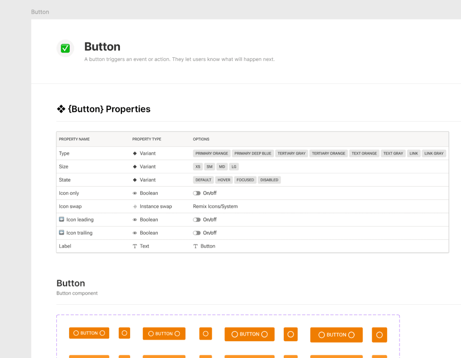
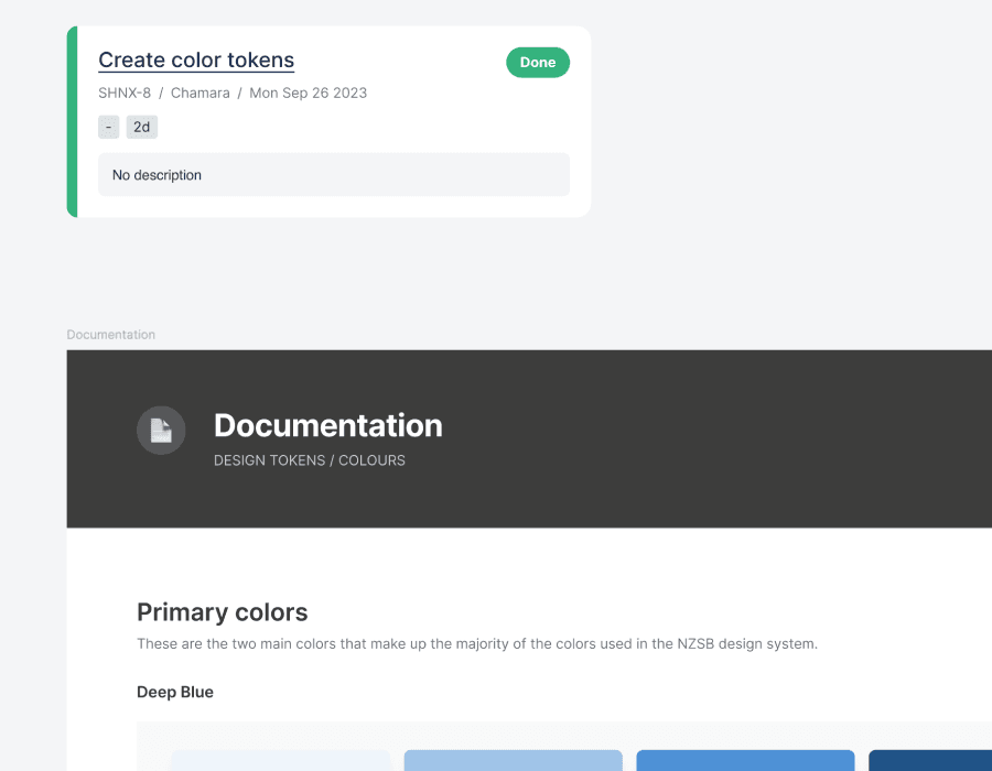
Well documented design system
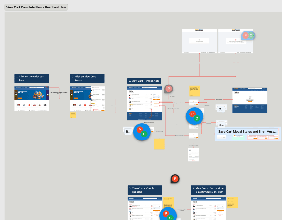
User flows in the design itself
Agile environment where all the work is task oriented
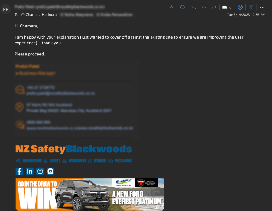
Client management and justifying my design decisions
By leveraging these insights, we successfully designed a solution that addressed the identified challenges and set the foundation for improved user experience and business outcomes.